Black@ Facebook: Arise Brand Identity
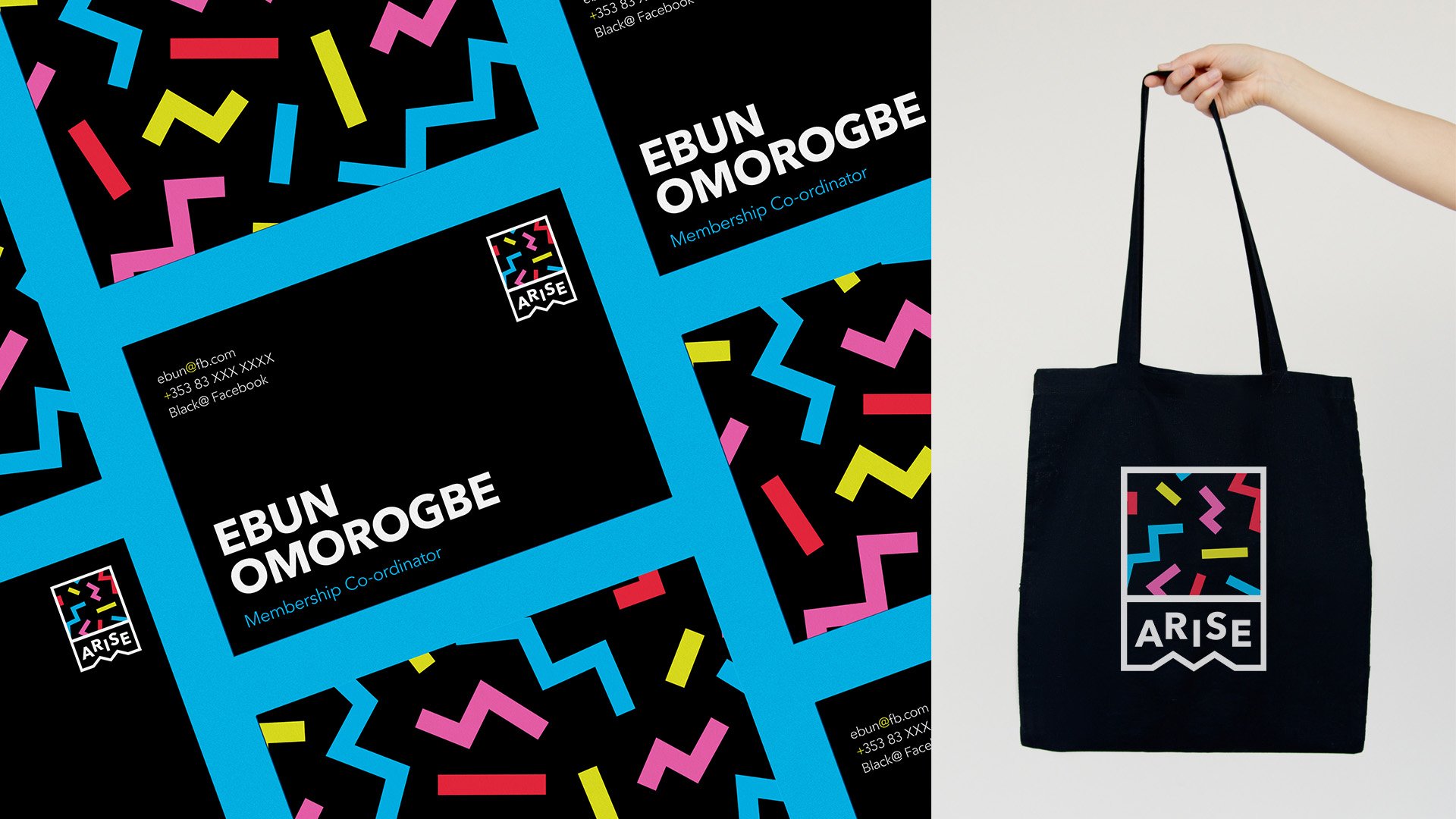
Facebook has an internal team called Black@ who are dedicated to uplifting and celebrating its Black employees and they also run many community programs for education and upskilling. Arise is one such program, aimed at getting more Black college students FB Blueprint certified. The brief was to create a sub brand for Black@ that was bright and would appeal to students while still being recognizable as the Black@ branding.
The shape of the logomark implies energy, upward mobility and overcoming. And the existing Black@ patterns were recoloured to be more eye catching and energetic. A simplified logo is used for small sizes and one colour printing.
Social media templates were created for the team so that they could quickly swap out the information when they had events, webinars or panels to promote online. The modular grid means each element can be swapped out and patterns can be alternated. This allowed them to easily create many different poster designs using the same assets, which feel brand new every time.
Services
Brand Identity ✦ Illustration ✦ Social Design